Members of the TPGi team gave several talks at the 33rd CSUN Assistive Technology Conference. Below is an overview of talks and includes links to slides where available.
Jaws Wide Open
By Steve Faulkner and Glen Gordon (Freedom Scientific) 
Anybody can now file a public issue on HTML/ARIA support in JAWS.
Key stakeholders benefit from open issue tracking of web standards support: users, web developers and software developers. Freedom Scientific have embraced this message and now track JAWS web standards implementation issues on a public GitHub repository. Along with the issue tracker there is documentation available as to how JAWS supports the features of HTML and ARIA.
Simplify Testing with JAWS Inspect
By Charlie Pike
How do you ensure that your website is compatible with JAWS? There may be barriers on your site that prevent users from accessing the content, barriers you may not be aware of if you’re unfamiliar with assistive technologies.
Jaws Inspect vastly simplifies the compatibility testing workflow. Using transcripts of JAWS speech, generated on demand for a whole page right down to a single element, testers can quickly identify and share issues with quality control and compliance systems. JAWS Inspect reduces the cost and inefficiencies associated with this kind of testing. End-user features are hidden away, leaving only the essential tools, so that testing teams can be up and running in minutes instead of days. For those already testing with JAWS, this means, faster, lower cost and more effective testing. For those new to JAWS testing, the barrier to entry is significantly reduced.
No slides available
The Velvet Rope
By Henny Swan 
There is little use in compliance with accessibility standards if your audience is unable to use your product. If a form is technically compliant is it accessible if a non-mouse user takes three times longer than a mouse user to submit it? What is the point of primary links tidied away behind a menu if the menu icon is unfamiliar and difficult to understand?
Accessibility is not just about meeting the standards. It’s not just a developer’s sport. Or an exercise in quality assurance. It’s about comparable user experience for people with different abilities. How we get there can be as innovative and creative as you want as long as the principles of accessible user experience are honoured.
This talk introduces real people with real issues they’ve encountered and how the Inclusive Design Principles can be a tool to help design better interfaces.
The velvet rope slides (SlideShare)
Everything I Know about Accessibility I Learned from Stack Overflow
By Adrian Roselli 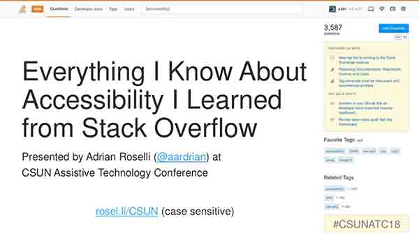
In the talk “Everything I Know About Accessibility I Learned from Stack Overflow” I walked through some examples of the kinds of questions and answers that developers can find on Stack Overflow, specifically ones that impact accessibility. In each case, my (anonymized) example demonstrated the general lack of good information around accessibility and how Stack Overflow’s model of the chosen answer not necessarily being the correct answer can lead developers astray.
From there, I challenged the audience of accessibility practitioners to not just laugh and groan at these examples, but to find ways to get involved with developers to try to more pro-actively educate them. The message was so well received that two gentlemen in the front row even flipped a table.
Everything I know about accessibility I learned from Stack Overflow (SlideShare)
Accessible User Experiences in 4 minutes 33 seconds
By Ian Pouncey 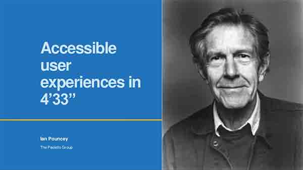
I spoke about how John Cage’s performance piece, 4’33”, is all about individual experiences, that everyone present gets to experience it in their own way, and everyone’s experience is equally valid and equivalent.
The aim of the presentation was to encourage people to think about how they can provide equivalent experiences to their audience, and to not stop at “accessible” when designing but to aim for “pleasurable” experiences for all regardless of their means of interaction.
Thanks to Alice Boxhall (penny whistle), Joe Dolson (fife), and Adrian Roselli (harmonica) for accompanying me (jaw harp) in a live performance.
Accessible user Experiences in 4 minutes 33 seconds (SlideShare)
Some User’s UX (SUX)
By Billy Gregory
Billy Gregory, Director of Training for TPG, presented his homage to short-sighted design, SUX: Some Users’ Experience.
Billy held nothing back in this talk about the various ways that the internet has alienated some users with the design choices we make on a regular basis.
From it’s opening musical number, to its somewhat regrettable Nickelback reference, SUX examined common design patterns, and created parallels to real world examples. When we only build the internet for the chosen few… that SUX.
No slides available.
An Overview of Today’s Most Challenging Accessibility Obstacles
By Hans Hillen 
This year I decided to hold a light and entertaining session where I and the attendees could vent about modern accessibility issues. So basically any accessibility issue that we didn’t have to deal with 10 years ago.
Throughout the talk I asked people to yell out their own pet peeves with current day accessibility, and a lot of people did. The contributions included things like form fields without borders, and shadow DOM content.
I chose to use (some of) our audit report categories as session structure, and picked two examples for each category. This lead to the following topics:
- Forms:
- Placeholder Labels
- Bad Error Validation
- Navigation:
- Lack of Focus Management
- Hijacked Scrolling
- Color:
- Links Without Underlines
- Text Placed On Top of Background Photos
- Images:
- Icon Fonts
- SVG Images
- Structure:
- Single Page Applications
- Responsive Data Tables
- Custom components:
- Everything
- Misuse of ARIA
I tried to keep the talk high level by using screenshots and recordings rather than code examples, and fun by putting on my ‘fed up grumpy consultant’ persona a bit. During the rest of the conference people came up to me to mention how they had enjoyed the talk and its format.
An overview of today’s most challenging accessibility obstacles (PPT)
Accessibility Meetups: Organizing Your Own Successful Group
By Dennis Deacon and Billy Gregory 
Billy Gregory, Director of Training and organizer of the Toronto, Canada accessibility meetup, and Dennis Deacon, Accessibility Engineer and organizer of the Chicago, U.S. accessibility meetup shared their experiences in starting, growing a nurturing their prospective meetup communities.
Key learnings include:
- Get help: it is very difficult to run a meetup on your own. It takes a team. It can be a lot of work.
- Be shameless: when asking for help, whether it be people to speak, venues to host, even sponsors to help financially support, be shameless and ask for what you want.
- Mix things up: to keep things fresh, mix up the formats, topics, even timing of events.
- Attendance: expect a gap between expected and actual attendance, and plan for it.
- Accessibility: ensure your meetups are accessible, from content presentation and delivery to venue spaces.
- Mistakes are ok: You may make mistakes. You may slip up in considering others. It’s ok, just learn and improve.
Accessibility Meetups: Organizing Your Own Successful Group slides (HTML)
Techniques for Kiosk Interface Accessibility
By Ryan Jones
As the use of self-service kiosk machines becomes more and more wide spread, it is important for companies, organizations, and government agencies to ensure the kiosks are usable by all people. In “Techniques for Making Accessible Kiosk Interfaces”, we discussed some of the most common considerations for kiosk accessibility. We began by discussing the various standards that may apply including WCAG, Section 508, ADA, and several others. We determined that it is often necessary to use a combination of different standards in order to create a fully accessible kiosk experience.
We then focused on considerations around how the choice of the kiosk operating system may impact accessibility. For example, it is important to note that kiosks running iOS or Android may be able to leverage the built-in accessibility features of those operating systems and kiosks running Windows may be able to leverage some of the main-stream assistive technology programs such as JAWS or ZoomText. We concluded by discussing various topics around the physical and software interface design including the use of physical controls and buttons.
One of the most important take-aways was that accessibility needs to be part of the entire process from beginning to end. In addition, it is critical to insure that employees who maintain the kiosks are aware of the accessibility features and carry out regular tests to insure the functionality is always ready and working.
Techniques for kiosk interface accessibility slides (PPT)
Get Up and Running Fast with Accessibility Resource Center
By Charlie Pike
There is a better way to find your route towards accessibility using TPGi’s Accessibility Resource Center (ARC). ARC includes next generation automated testing. Our solution looks for machine-detectable accessibility defects within digital content. Designed for rapid scanning of a web domain, ARC will crawl through your website looking for accessibility violations against common standards, including WCAG 2.0 A/AA.
ARC is powerful. It takes scanning data and turns it into actionable insights. Need to know what pages have the highest density of certain types of accessibility defects? Need to track progress over time or compare the performance of different sites? Use ARC’s dashboards and data visualization features to guide you towards what you need to be concerned most about, and what you should fix first.
No slides available
Cognitive Disabilities: An ICT Conundrum
By Kurt Mattes 
Intuitive is in the mind of the beholder. Intuitive is determined at a given moment since the beholder’s mind, in fact every mind, performs in regularly variable ways. Consider your mind’s ability just after waking versus the end of an exhausting day versus when the children are arguing in the car and that person just cut you off. Our cognitive abilities are influenced by a cornucopia of factors including life experiences, time, disease, and events as simple as falling and bumping our head.
ICT is intuitive when options and information aligning with our cognitive abilities at a given moment are available. From time to time, anyone might need a little hint to pull something out of memory. Or maybe it’s just a little more space between sentences that makes readability or comprehension easier, and in some cases, possible.
Offering more options to accomplish a task, providing simple means to obtain more information about UI and UX components, and giving more interaction flexibility affords opportunities for access aligning with a person’s cognitive needs of the moment.
Cognitive disabilities: an ICT conundrum slides (PPT)
Reimagining Accessibility Guidelines
By Jeanne Spellman of TPG, Shawn Lauriat of Google, and Jennison Asuncion of LinkedIn 
We presented “Reimagining Accessibility Guidelines” to a surprisingly full audience for 8:00 AM on a Friday morning. Spellman and Lauriat are co-facilitators of the Silver Task Force of the W3C Accessibility Guidelines Working Group. Asuncion, who is also a member of the Silver Community Group, moderated. The task of the Silver Task Force and Silver Community Group is to do the preliminary research and planning for the next version of Accessibility Guidelines that will be the successor to WCAG 2.x. The Silver Community Group is open to the public and only requires a (free) W3C account.
Spellman and Lauriat presented the overview, goals and timeline for the Silver project. The meat of the presentation was the results of the research into the structure of WCAG and other W3C Accessibility Guidelines (including Authoring Tool Accessibility Guidelines (ATAG) 2.0, User Agent Accessibility Guidelines (UAAG) 2.0, and ARIA Authoring Practices 1.1. The Silver Task Force identified eleven problem statements with the structure of current accessibility guidelines that need to be solved for Silver. Prior to CSUN, the task force held a design sprint with thought leaders across the accessibility industry for solutions to those 11 problems. Spellman and Lauriat concluded by briefly discussed the preliminary outcomes of the Design Sprint and taking questions.
Reimagining Accessibility Guidelines slides (Google Slides)
Mike Paciello’s Challenge Coin
In celebration of his career, TPGi presented Mike with 300 limited edition custom coins. These coins included an assortment of design elements highlighting accessibility initiatives Mike has either lead or contributed to during the course of his career.
“There is no greater tribute then peer recognition. In my case, the thoughtfulness put into the creation of the ‘Mike’ challenge coin will forever be one of my fondest professional memories. Thanks to the entire TPGi team!”
The presentation of these coins took place on Wednesday evening. In only 3 days Mike distributed over 200 coins to CSUN participants.
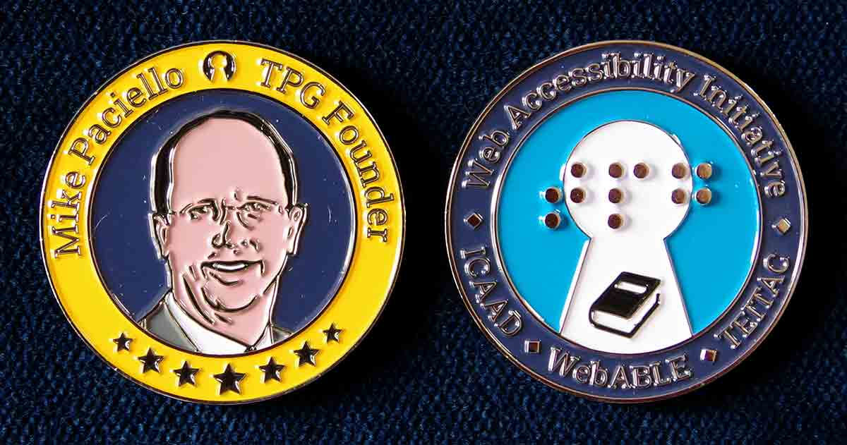
The front and back of the challenge coin.