This is the last in the current series of articles looking at adaptations for accessibility, based on new techniques or research. The last part discussed “invert brightness”.
Many people in the world have some difficulty in perceiving colour. A very well-known condition is “red-green colour blindness” (there are actually two different sub-types of this, deuteranomaly and protanomaly), though there are several other types of colour deficit.
Practical Steps
The fundamental solution to this problem, which also helps people with no colour perception, is to not rely on colour alone to convey information—use position, size, shape and other visual characteristics (as well as a textual equivalent for people who cannot see).
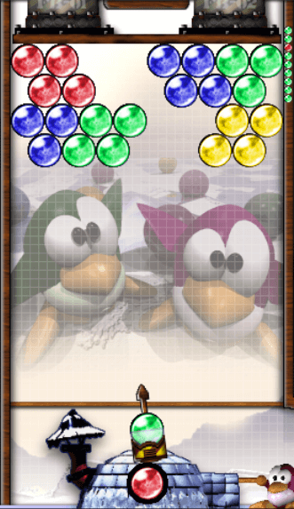
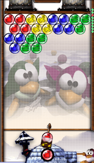
Some computer games offer settings to make things clearer for people with colour perception difficulties. Frozen Bubble, for example, involves matching bubbles of different colours. A range of colours are used and, whilst they are quite close to the primary colours, they could be hard to discern. There is an option to include prominent shapes within the bubbles, so that shape can be used as a differentiator too.


More information on games and colour deficit can be found below.
The use of shapes as well as colour is a great technique. GitHub uses shaped status indicators so that their colour isn’t the only thing that indicates success or failure. Coupled with a text alternative for the images, this is a robust accessibility technique that helps many users.
alt text<p>Status: <img src="green-tick.svg" alt="Success"></p>
<p>Status: <img src="red-cross.svg" alt="Failure"></p>Providing two different ways of conveying the same information redundantly (be it colour and shape, or sight and sound) is proven to be beneficial to everyone’s perception. Great examples such as those above are to be lauded and will always be best practice. However, it would be great if there was more we could do to provide information to someone who can see colour, but just not all colours…
Addressing the fundamental problem
One of the main difficulties that people with these conditions have is that, due to their more limited spectrum of colour perception, they can miss out on important information that is innately apparent to other people who have good colour vision. One such example is the ability to identify different fruits that may be on sale on a market stall. Apples and oranges may look very different if you see colour well, but if not, from a distance they can be hard to distinguish.
Colour provides a means to differentiate, and the lack of being able to do so causes a loss of information (that there are two different types of fruits on this stall), and thus presents an accessibility barrier.
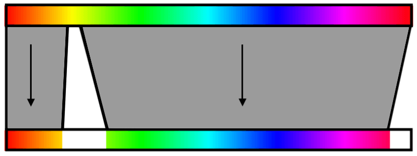
Some time ago I stumbled upon a brilliant solution to this problem. The approach taken was to solve the underlying problem—the lack of bandwidth to convey visual information—by considering the spectrum of colours that the user can see and differentiate and using only that to display images. Colours the user cannot distinguish are moved further apart, by increasing contrast between them, and variations in, e.g. red-green, are converted to other features such as variations in brightness or between other colours. A simplified way to think of it is to imagine the whole full-colour spectrum is effectively squeezed into the range of colours that a person with any particular type of colour defect can distinguish (plus other features such as brightness, to mitigate against any loss of information).

Whilst someone with colour defect is unable to perceive, for example, green as others may know it, and maybe can’t tell apart some shades of red or green, this clever processing technique re-maps “red-green” to something the person is able to distinguish. The image doesn’t look how others would see it—it is expressed using a more limited pallet, but that’s the point: because it is using the more limited palette, it’s able to transfer more of its original information content to the user.
You can find some examples and pictorial demonstrations of this on the VisCheck website.
Current and future app and platform support
A number of applications have been created over the years to simulate colour deficit, including Huetility (since removed from the app store) and Chromatic Vision Simulator. These are great for allowing people to experience what it’s like to have colour deficit, which raises awareness and allows designers to check that their designs will be accessible out of the box.
It is also very helpful to have adaptations built into the platform/device to help users perceive content that is not immediately accessible and both Google and Apple provide such features (links below).
It is great to see these adaptations being made readily available on platforms that so many people use.
Resources
Gaming:
- Red vs. Green: Gaming with colour blindness
- Colorblind accessibility in video games – is the industry heading in the right direction?
- What It’s Like To Play Games When You’re Colorblind
Colour deficit simulation and correction: