With prefers-reduced-motion (part of CSS Media Queries Level 5’s User Preferences Media Features) it’s possible to easily suppress, or provide alternatives to, unnecessary and problematic animation effects on websites, based on whether or not users have set the relevant preference (in their browser or operating system).
Though slightly older, James Craig’s Responsive Design for Motion gives an excellent overview of the challenges associated with the use of motion effects and animations for users with vestibular spectrum disorders. More recently Eric Bailey’s Revisiting prefers-reduced-motion, the reduced motion media query delved deeper into the benefits of reduced motion for neurodivergent users and users with cognitive disabilities.
Providing specific styles based on prefers-reduced-motion is a solid way to satisfy the new WCAG 2.1 Success Criterion 2.3.3 Animation from Interactions. Browser support for this media feature is slowly increasing (see caniuse.com support tables for prefers-reduced-motion), and many sites and frameworks are beginning to take advantage of this functionality. However, this media feature has also led to some mild user confusion.
As a little anecdote, in my spare time I contribute to Bootstrap. Support for prefers-reduced-motion was included, without much fanfare, in Bootstrap 4.1 in January 2018. At that time, only Safari on macOS supported this media feature. A few months later, Firefox was the first browser on Windows to also support it…and within days of its release, we started to see a number of bug reports on our issue tracker from annoyed developers, complaining that animations (such as slide transitions in the carousel) stopped working.
After some initial head scratching, it became clear that these developers had explicitly turned off animations in Windows – not because of any motion sickness or similar discomfort caused by animations, but purely for performance and/or aesthetic reasons.
Out of the box, Windows (like most operating systems) comes with a wide range of “eye candy” animation effects which are not to everybody’s liking…and there is a huge pool of helpful articles on how to turn them off.
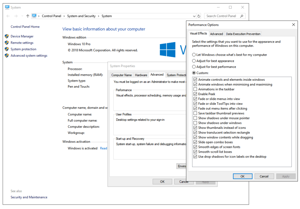
One set of options to turn these animations off is rather cryptically hidden under “Control Panel > System and Security > System > Advanced System Settings > Performance settings > Visual effects”. The first option, “Animate controls and elements inside windows”, is the one that, when unchecked, sets the system-wide prefers-reduced-motion setting, while the other options mostly relate to animation effects of Windows itself (such as fading effects on menus and native list boxes, or the shrinking/growing animations when application windows get minimized/maximized).
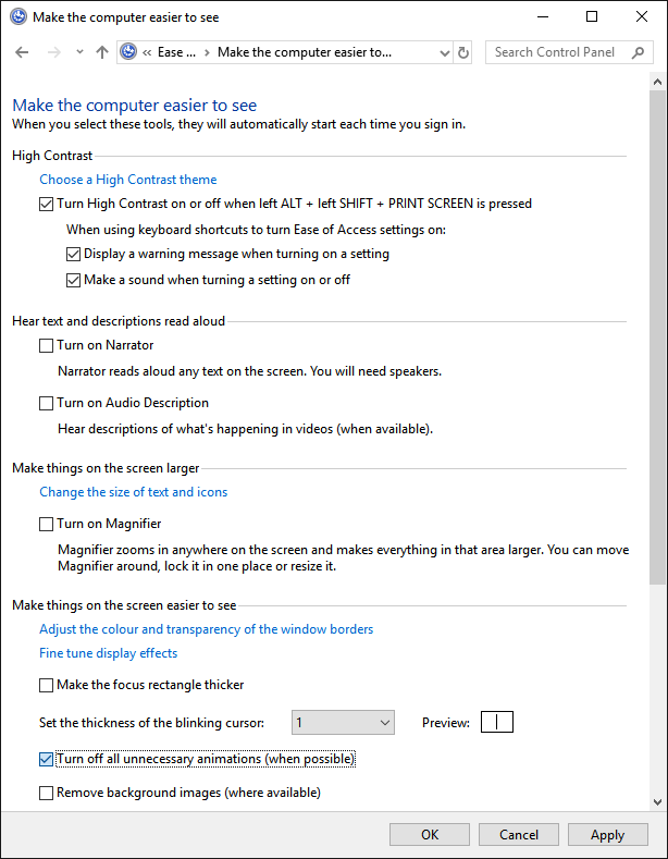
A second option is available under “Control Panel > Ease of Access > Ease of Access Centre > Make the computer easier to see”, which has a checkbox “Turn off all unnecessary animations (where possible)”, which acts as a sort of “master switch” that checks/unchecks most of the options related to visual effect, and also controls the prefers-reduced-motion system setting.
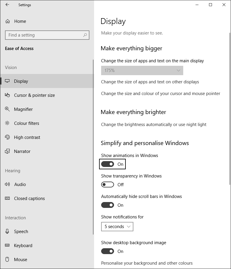
And lastly, in line with the new streamlined look and feel in Windows 10, there is a similar on/off toggle in “Settings > Ease of Access > Display > Show animations in Windows”, which again also sets the prefers-reduced-motion preference.
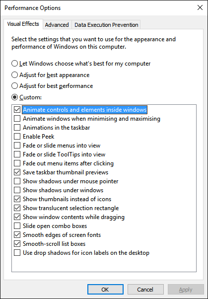
As an aside, I would not recommend mixing and matching where you set these options, as they seem to very easily go out of sync with each other.
Users who want to disable the majority of Windows-specific visual effects, but who also still want to see animations and motion effects in their web content, should steer clear of the “Control Panel > Ease of Access” and “Settings > Ease of Access” options, as they don’t offer any granularity – animations (including animations in web content in browsers that support prefers-reduced-motion) are either all enabled or disabled. Instead, they should specifically disable the relevant Windows-specific effects in the “Advanced System Settings”, making sure to leave the “Animate controls and elements inside windows” option checked. And, if you’re a tester/auditor, I would also recommend just sticking to this particular checkbox when testing for 2.3.3 Animation from Interactions – unless you enjoy spending time after each round of testing to reset your Windows environment the way you like it.
Unfortunately, beyond user education (and being prepared to explain to certain users why “animations are broken”), there’s not much more that can be done (barring some notification or message on your web content that is shown when the prefers-reduced-motion styles are in effect). The point here is mostly that as positive as these new user preference media features are, they have the potential for user confusion. And perhaps that the Windows team may want to consider adding some further context or explanation to their settings, to make users aware of the fact they’re not just changing the look and feel of Windows itself, but that they are setting a system-wide preference which may have an impact on applications and web content.
Other Platforms
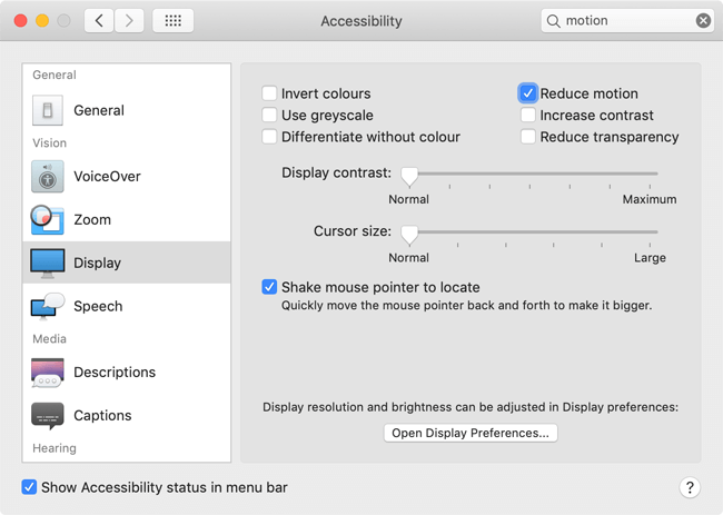
For completeness, it’s worth noting that of course other operating systems also have system-wide settings that signal the user’s prefers-reduced-motion preference. On macOS, “System Preferences > Accessibility > Display” has the “Reduce motion” checkbox.
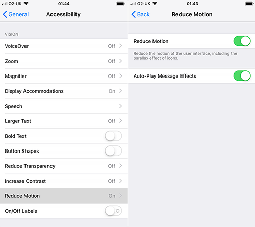
In iOS, the “Reduce motion” toggle is found in “Settings > Accessibility”.
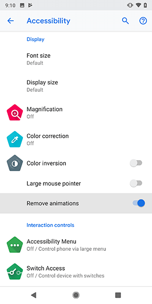
And in Android 9, “Settings > Accessibility” has a “Remove animations” toggle.
Strangely, at least in the Bootstrap project, we’ve not had any issues filed from developers using those platforms. That’s not to say that some users won’t end up enabling these settings without realising that they’ll somehow affect web content as well…but at least for now, I’d hazard a guess that the fact that these settings are explicitly under “Accessibility” (rather than “Performance options” as in Windows) make users less likely to enable them unknowingly or for different reasons other than a genuine accessibility need.