People who are new to accessibility may be unaware of the way that headings can help readers. They help “chunk” and label groups of related content. And people who use assistive technologies such as screen readers can quickly and effectively navigate a page by its headings.
In this article, I hope to highlight guidance in implementing headings by referring to the associated Web Content Accessibility Guidelines (WCAG) 2.1 success criteria:
- 1.3.1 Info and Relationships (Level A)
- 2.4.6 Headings and Labels (Level AA)
- 2.4.10 Section Headings (Level AAA)
Impact of headings
A heading is text that describes the content that follows it. A page heading describes the overall page content, while subheadings describe content within sections (and subsections) of the page.

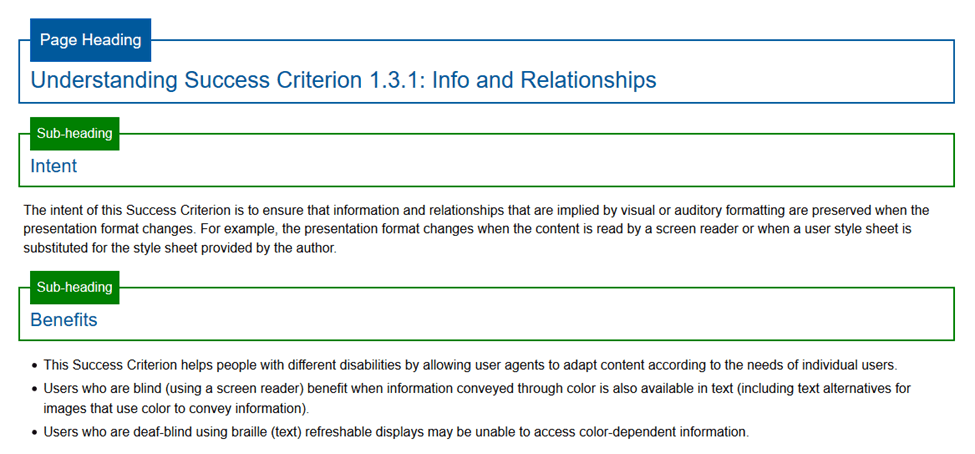
Visually, headings are typically presented using unique styling—size, weight and color—compared with normal body text. The size of heading text commonly suggests its level in the heading hierarchy. A page heading is typically the largest heading, with each subsequent subheading level decreasing in size or weight. Headings visually allow people to scan the page for the content they are looking for. Sounds like a form of navigation, doesn’t it?
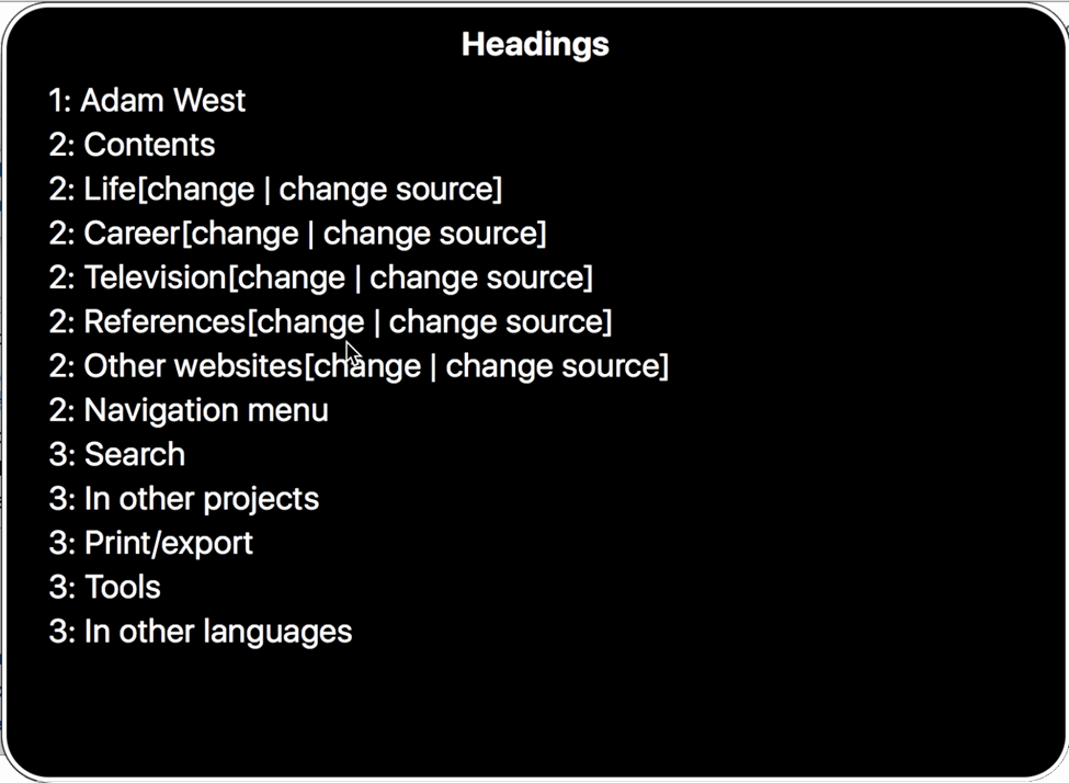
While styling helps to visually communicate the information and relationship of headings compared with surrounding content, styling does not provide their programmatic meaning, or semantics. People who lack vision have no way of knowing what text is associated with groups of content if their only difference is styling. For that reason, you must use semantic markup to programmatically define these relationships and hierarchy. Doing so will allow assistive technologies such as screen readers to easily consume your content.
Enter WCAG
Success Criterion 1.3.1 Info and Relationships (Level A) states that headings must be presented using semantic markup (such as h1–h6). This success criterion does not mandate you use headings, just that you need to properly mark them up if you have text in a page that looks and acts like headings. It is a best practice to start at the highest heading level (h1) to provide information on a document’s topic or theme, then use the next level in the hierarchy for its subheading, without skipping levels.
Note: Never use semantic HTML heading markup for visual styling elements that aren’t headings.
A Quick Note on Semantics
If a scenario arises where you can’t make changes to existing elements’ hierarchy, there is an alternative method that you can use to provide semantics: using Accessible Rich Internet Applications (ARIA).
role="heading"can be placed on an element to assign it a role of heading.aria-levelneeds to be placed on the same element asrole="heading"to assign the element’s heading level.
An example:
See the Pen
Accessible Headings by deconspray (@deconspray)
on CodePen.
Use ARIA only when you cannot mark up with native HTML elements. Remember the first rule of ARIA.
Quality of Heading Text
So far, I’ve talked about how heading text needs to be marked up as such. But we haven’t touched on the text inside the heading. As you may have experienced in the real world, many times the quality of a heading’s text leaves a lot to be desired. An example:

In this example, I can gather that this page is related to an HR solution. But the heading text does not provide those details.
A heading’s quality can greatly impact its effectiveness. The quality of a heading’s text is addressed by WCAG Success Criterion 2.4.6 Headings and Labels (Level AA). This criterion addresses only the quality of the heading text, not the existence of semantic headings in your markup.
Headings should be descriptive, clear and concise. Headings are meant to be scanned, both visually and with assistive technology. Headings should explain what the page or the section of the page is about. By crafting descriptive headings, you make it easier for screen-reader users to determine a page’s structure and navigating its headings.

Section Headings
WCAG 2.1 through Level AA doesn’t require subheadings. Level AAA takes it up a level.
Success Criterion 2.4.10 Section Headings (Level AAA) requires that you use section headings to organize content. When heading-like text is present, you also need to semantically mark them up as headings. This criterion is set at Level AAA because of the potential challenges that many developers may have in altering their applications’ designs for the sake of section headings. But while adding section headings goes beyond what the Level AA standard requires, I always recommend doing so as a best practice because section headings help everyone.
Summary
- Visual headings must be marked up as such. (Success Criterion 1.3.1 Info and Relationships (Level A))
- Headings must be concise and descriptive, not filled with cutesiness or marketese. (2.4.6 Headings and Labels (Level AA))
- A
h1heading element is not required for Level AA conformance(but it’s a best practice toward good accessibility). - Using heading levels in sequential order is not required for Level AA conformance (but it’s a best practice toward good accessibility).
- Subheading markup is not required for Level AA compliance. It is required for Level AAA conformance, or if you just want to make your content as accessible as possible for everyone (Success Criterion 2.4.10 Section Headings (Level AAA).