Knowbility’s Accessible Internet Rally, or AIR, provides the perfect framework for learning what matters in digital accessibility.
Accessibility is the practice of providing features that work for people with disabilities. In the physical environment, these features include braille and raised lettering on signs and elevator buttons, alarms that flash and sound, ramped entryways and automatic doors. In the digital world, accessibility features include buttons and links with screen-readable labels, media with text alternatives, controls that respond to a click, keypress, or eye gaze.
Accessibility as a practice is a relatively new consideration for digital makers. Most of today’s digital designers, architects, and builders were not taught accessibility requirements. In their Why Teach Accessibility? Fact Sheet, Teach Access found among member schools that “less than 3% of engineering and computing technology course descriptions reference ‘accessibility’ or ‘people with disabilities.’” Partnership on Employment and Accessible Technology (PEAT) summarizes the Accessible Technology Skills Gap with findings that show a significant distance between the accessibility skills companies seek and what applicants know. “During orientation we ask whether new hires know the basics of accessible tech. Less than 1 in 10 have ever even heard of it.”
Building accessible digital content and services means we all have a lot to learn.
For me, learning by doing is the best way to build knowledge and skills, working with real tools to solve real problems. Abstract concepts start to make sense when I can apply them and see what happens as a result.
Learning digital accessibility can be daunting. The common source of knowledge is a fairly complex set of guidelines that are by design built on abstract concepts, to keep their relevance as technology changes. The Web Content Accessibility Guidelines, or WCAG, are an amazing resource and how-to guide—once you get the hang of them.
Working at TPGi I am fortunate to have the best mentors. Steve Faulkner, Hans Hillen, and Gez Lemon, TPGi’s distinguished engineers, were my very first mentors as I learned my way around WCAG, auditing digital content and resources against standards. And still, every day I learn something new from my colleagues.
Learning by teaching is another way to build expertise. It’s a challenge to explain and share accessibility requirements in ways that are meaningful and that will stick. Teaching (and writing) brings into sharp relief what you think you know, and what you don’t know. It’s an opportunity to learn more—to deepen knowledge and sharpen skills, in order to be an effective teacher.
Which is one reason I love Knowbility’s annual Accessible Internet Rally (AIR), where teaching, learning, and doing all come together, and everyone benefits. Each year, Knowbility pulls together teams of volunteer designers, developers, and digital accessibility mentors and matches them with clients from nonprofits, community organizations, schools, and artists. They have six weeks to develop a website together, to submit for judging by the AIR judges, and to be used by the client ongoing.
Many TPGi staff participate in Knowbility events, for example, as AIR mentors and instructors at AccessU. We recognize how much we all stand to benefit by teaching and learning.
I’ve participated as a mentor twice, in 2016 and 2019. (And this year, my team won!) Both times I was so impressed by the dedication and persistence of the teams. The structure of AIR brings out the best in accessibility and digital product development, providing a perfect context to balance accessibility requirements with design and functional requirements to support the workings of the non-profit.
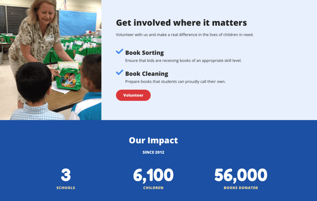
There was a moment in this last rally that epitomized this dynamic. The team had mocked up a homepage and called a meeting to share the design with the client, Texas Kids Read. The Austin-based non-profit donates books to schools in low-income neighborhoods. “The books Texas Kids Read gives the students are often the first books they own.”
As a way of illustrating the impact of the non-profit, the AIR team included a counter feature that animated like the number wheels on a gas pump, counting up to the total number of schools, kids, and books. Both the client and team liked the feature because it was attention grabbing and conveyed an increasing positive impact on kids. As accessibility mentor, I explained how the feature might distract people or cause discomfort or even illness due to the moving, flashing white text on a dark background. I was prepared to bring up the AIR judging requirements related to distracting content and stress the points the judges would deduct if we kept the feature. But there was no need. No one wanted a feature that caused harm. We all agreed that the same effect could be achieved with a more subtle animation, with the totals “3 schools”, “6,100 children”, and “56,000 books donated” fading up from below.

The AIR event has lots to teach us about teaching and learning accessibility. Knowbility makes accessibility a requirement at the start, which makes it easy for clients to prioritize accessibility. Mentors can learn how to share accessibility awareness, in this case, by describing impact on people rather than pointing at technical standards. Designers, architects, and builders learn that, if they think creatively, there’s always a way to design for accessibility.