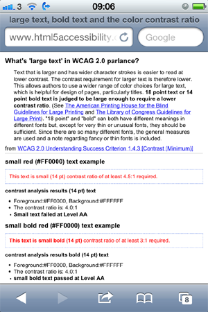
I put together an example page, mainly for my own use, providing some examples of what in WCAG 2.0 terms is considered large and small text. WCAG 2.0 provides the font measurements in terms of points, so I initially used the CSS pt unit to set the font size in the examples, but have changed it to em’s after discussion with @goetsu.
large text, bold text and the color contrast ratio
The WCAG 2.0 criterion 1.4.3 Contrast (Minimum) states:
The visual presentation of text and images of text has a contrast ratio of at least 4.5:1, except for the following:(Level AA)
- Large Text: Large-scale text and images of large-scale text have a contrast ratio of at least 3:1;
- Incidental: Text or images of text that are part of an inactive user interface component, that are pure decoration, that are not visible to anyone, or that are part of a picture that contains significant other visual content, have no contrast requirement.
- Logotypes: Text that is part of a logo or brand name has no minimum contrast requirement.
WCAG 2.0 Understanding Success Criterion 1.4.3 [Contrast (Minimum)] defines large text:
Text that is larger and has wider character strokes is easier to read at lower contrast. The contrast requirement for larger text is therefore lower. This allows authors to use a wider range of color choices for large text, which is helpful for design of pages, particularly titles. 18 point text or 14 point bold text is judged to be large enough to require a lower contrast ratio. (See The American Printing House for the Blind Guidelines for Large Printing and The Library of Congress Guidelines for Large Print). “18 point” and “bold” can both have different meanings in different fonts but, except for very thin or unusual fonts, they should be sufficient. Since there are so many different fonts, the general measures are used and a note regarding fancy or thin fonts is included.
Note 3: The actual size of the character that a user sees is dependent both on the author-defined size and the user’s display or user-agent settings. For many mainstream body text fonts, 14 and 18 point is roughly equivalent to 18.75px and 24px or 1.2 and 1.5 em or to 120% or 150% of the default size for body text (assuming that the body font is 100%), but authors would need to check this for the particular fonts in use. When fonts are defined in relative units, the actual point size is calculated by the user agent for display. The point size should be obtained from the user agent, or calculated based on font metrics as the user agent does, when evaluating this success criterion. Users who have low vision would be responsible for choosing appropriate settings.
Large, small and bold text reference page
I wanted a reference page which illustrated small, small bold and large text as defined in WCAG 2.0 so I created one: Large text, bold text and the color contrast ratio
NOTE: use of pt for screen media is not recommended
Use of pt is not recommended for screen media only for print:
The so-called absolute units (cm, mm, in, pt and pc) mean the same in CSS as everywhere else. A length expressed in any of these will appear as exactly that size (within the precision of the hardware and software). They are not recommended for use on screen, because screen sizes vary so much. A big screen may be 60cm (24in), a small, portable screen is maybe only 8cm. And you don’t look at them from the same distance.
A guide of limited utility
Checking the example page on my iPhone I found that all the text is scaled down so what may be considered as large text on a PC screen is not on a phone or other device.

Contrast ratio rule of thumb
The take away from this is that it is likely your pages will be viewed on a range of devices and screen sizes, so I suggest sticking with the 4.5:1 color ratio for all text.
Comments
I myself (and also my clients) often encounter a problem how to measure font size on a web page in order to determine which value of contrast ratio (4.5:1 ar 3:1) is relevant for measuring contrast. That´s why I wrote a brief instructions how to do it. Maybe somebody could find it useful. The article is here: How to measure font size on a web page.
Hi Radek, thanks!
I also recently found a LargeText favelet that creates a movable box on the page with samples of “large text”. By Jim Thatcher
I recently worked on a HTML5 contrast checker. It is fairly simple and I think may help people understand how color contrast checking with 12pt and 18 pt fonts works.
https://contrastchecker.com/