CSS sprites are a useful method to display graphics while preserving bandwith and improving page rendering times. One of the problems with CSS sprites when it comes to their accessibility is that some operating system display themes such as Windows High Contrast mode have the effect of hiding CSS background images. So if an alternative version of the image is to be displayed when a user changes the default theme to suit their requirements, the developer has needed to provide an alternative with images inserted inline rather than as CSS background images. In many cases the developer does not do this, as it is a lot of extra work and undermines the performance benefits of CSS sprites.
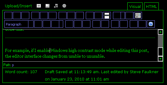
Interfaces can become unusable when high contrast mode is enabled
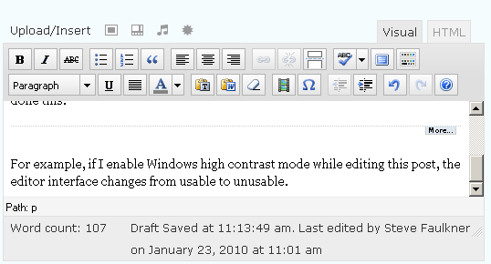
If for example, I enable Windows high contrast mode while editing this post, the editor interface changes from usable to unusable, as I no longer have any idea what the majority of the buttons on the editor do.


Enabling Windows high contrast mode
- Windows XP – Choose a High Contrast Color Combination to Improve Screen Resolution
- Vista – Turn on High Contrast and change the settings
CSS sprites using the before: pseudo element
An alternative to implementing CSS sprites using the traditonal background-image method is available and it resolves the issue of images not being displayed in high contrast mode. This alternative method makes use of the CSS before: pseudo element (note: the after: pseudo element could also be used).
Example:
![]()
![]()
CSS
span.test1:before {

margin-right: -10px;

content: url(icons.png);

position:relative;

left:-2px;

top:-109px;

}
span.test1 {width:17px;

height:18px;

display:inline-block;

overflow:hidden;}
HTML
<a href="#"><span class="test1"></span>Home</a>
Further examples are available on the CSS sprites using the before: pseudo element example page.
Notes:
- This is only a proof of concept. I am sure this method can be improved by people who have better CSS skills.
- The use of the same set icon set for both default and high contrast view is not recommended as the contrast, as in the case of the examples, may be poor when high contrast mode is enabled. A high contrast mode detection script is available, which can be used to swap icon sets as appropriate.
- I have tested this method in IE 8 (previous versions don’t support
before:selector), Firefox 3.6, Opera 10.10, Safari 4 and Chrome 4. They all seem to work fine, but the high contrast mode aspect is currently moot for Opera, Chrome and safari, as they don’t yet support Windows high contrast mode.
Comments
How many people suffer from slow websites and how many uses high contrast mode? It seems the described issue is a very minor one.
hi Sunnbear, not quite sure of your point, one of the reasons why CSS sprites are so popular is their improved performance compared to inline images. As far as high contrast mode use goes, it is not a minor issue if you are a government or eductaional site or a comapny trying to sell to the U.S. and other governments (which require that apllications are accessible) or you are an online service provider such as a bank or retailer that wants to increase their market share or avoid being sued.
This is great! We use sprite maps all the time for performance reasons. It just makes sense to not do 30 fetches for 30 little icons. At the same time, as your article clearly shows, css background images are considered decorative and disposable for high contrast users on Windows, ruining the utility of many UIs. Now we can have performance and accessibility. Thanks for the useful technique and the mention of my axs library.
Note that the specific axs library method is hd() for high contrast detect. Details can be found here:
https://dev.aol.com/downloads/axs1.2/readme.html#hd
Interesting solution.
Once the background images “become content” it is very similar to the technique I use here:
https://tjkdesign.com/articles/how-to_use_sprites_with_my_Image_Replacement_technique.asp
Hi Thierry, thanks for pointing your post out: how to use sprites with my Image Replacement technique.
Glad you like it Chris! It is due to AOL’s and TPG’s collaboration via the Aegis project that this work came about.
Very cool trick. I still do quite a bit of development and design work that needs to meet accessibility requirements; both the formal WCAG and internal client style guides. And the use of sprites for navigational purposes is often discouraged due to the issues you point out. This may solve many of the problems associated with the use of sprites. Thank you for sharing!
@sunnbear: It’s definitely not as uncommon as you may think. 🙂
Great tip. But a pity that old IE browsers don’t support the :before and :after selectors. There are many people still browsing with IE7 and even 6 (like the British Government and NHS).