A discussion on the WHATWG list about the limitations/issues with the current design of the summary and details elements, brought forth the following comment:
[me: ] in the absence of browser making “clicks on (non-interactive) parts of the summary defer to the disclosure triangle.” how is an author supposed to do this?
[hixie:] The author isn’t supposed to do this. The whole point of semantic controls like this [details/summary] is that the user agent is the one that picks the user interface.
Once we start talking about custom widgets, we’re in the space of Web components, at which point the author can do whatever the author wants. [emphasis mine]
source: https://lists.w3.org/Archives/Public/www-archive/2014Apr/0012.html
Don’t fear – embrace
Which got me to thinking that we should be embracing web components as an opportunity to improve the usability and accessibility of native HTML controls and content. It’s a little sad that the way to fix accessibility and usability in a native UI is to create a custom UI, rather than ensuring by design of the HTML feature that usability and accessibility are built in, but if it is to be, lets embrace it.
A simple demo
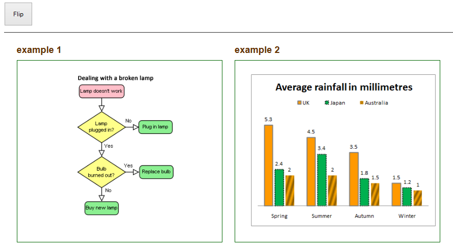
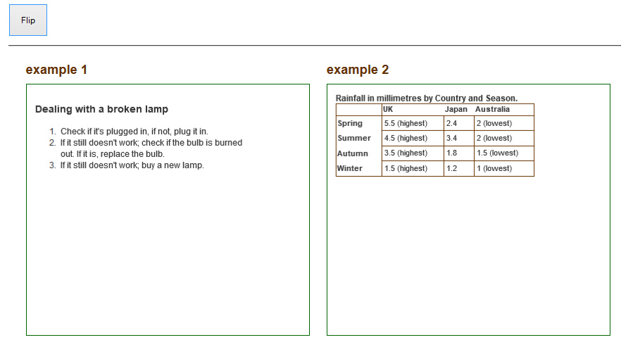
To this end, I have made a simple demo using the flipbox web component, to illustrate use of a web component to provide easy display of rich text alternatives for images using a natty interaction pattern:


Comments
“It’s a little sad that the way to fix accessibility and usability in a native UI is to create a custom UI, rather than ensuring by design of the HTML feature that usability and accessibility are built in, but if it is to be, lets embrace it.”
It isn’t just sad, it is likely to be negative overall. The main advantage of native elements / UIs is that they are consistent for the user.
Even a sub-par UI is better if it works how you expect, in usability consistency trumps the ideal interface. (E.g. blue isn’t the ideal colour for making links stand out, but everyone knows what they mean.)
If people create their own versions of details/summary (for example) then you will get many variations, and each has to be learned.
The other factor is whether the widget changes across platforms. For example, form controls vary depending on the platform, but (I assume) web components would not? You might end up with developers making assumptions that all platforms work like theirs. Ok, that’s a weak point in this case, but it reminds me of the many iOS-like apps launched on Android.
I like the idea of web components, but it is something of a pandora’s box in terms of interfaces. The web has been quite constrained in terms of interfaces so far, which considering there is no “owner” of the web has worked to keep things relatively simple. In less constrained environments (e.g. app development) you tend to have an authority (e.g. Apple for iOS) saying how interfaces should behave.
No constraint here…
People already do. That’s why design patterns are important. Most JavaScript libraries have a disclosure widget. While I agree platform consistency is important, the web is its own platform and web platform consistency needs to be considered. I don’t agree that we have to accept sub optimal UI for consistencies sake. Often times a minor tweak makes the difference between a usable control and an unusable one.
In the case of details/summary, the OSX convention is that only the disclosure triangle is interactive (approx 13pxX13px) click area. Why would we want to constrain the design to honour this?
Details/summary isn’t common enough to have ‘consistency’ for users, so lets not give up on improving that!
I guess I was thinking of examples like the select box, which is represented in quite different ways across platforms (at least desktop to mobile), and is adapted for the device. E.g. the iOS wheel thingy.
Can web components do that? I guess you can use responsive techniques to achieve some variation, but if the widget should equate to an application role, would that be adaptable by the UA?
This is a very tough and sensitive topic (native versus custom/component). I tend to side with Alastair’s argument above. And I think Steve’s initial gut feeling is correct. Native is much better because it requires much less effort from the developer. Isn’t that the underlying idea behind much of HTML5?
Generally, a component requires “re-inventing the wheel” (including accessibility), requires extra JS, and creates code fragmentation and confusion. It’s too bad that browsers don’t support the specs well in so many cases, especially regarding keyboard access (details/summary, title attribute, video controls, longdesc etc); if they did, we wouldn’t have such a big mess.