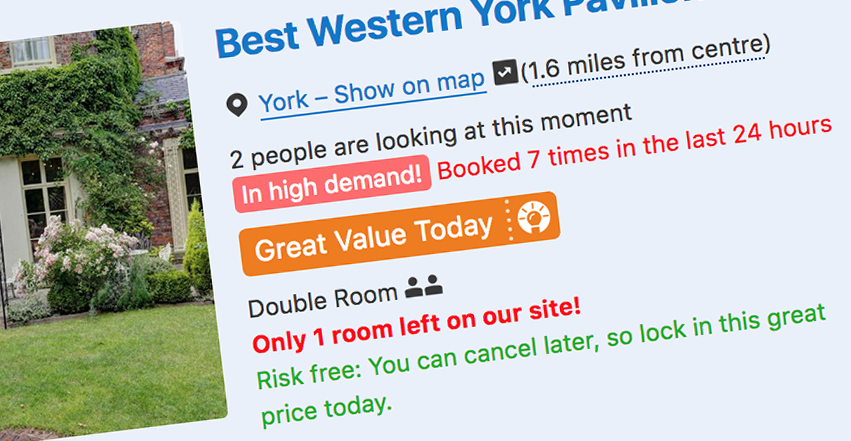
 Anyone booking a vacation has likely encountered persuasive notifications urging them to “Hurry, only 2 tickets left!” or to “Book now as 6 other people are viewing this hotel”.
We’ve all fumbled to enter our credit-card details as an ominous timer counts down the number of minutes remaining to complete our transaction. The web is awash with all manner of so-called dark patterns, designed to convert visitors and part them from their money. While such intrusions can be a source of irritation or even stress for many people, they may be complete showstoppers for people with anxiety or panic disorders.
Anxiety disorders comprise a range of mental illnesses that are characterised by excessive feelings of fear, apprehension, and dread. For example, social anxiety disorder is an intense fear of being embarrassed, humiliated, or judged negatively by others in a social or work setting. Claustrophobia is the fear of confined spaces. Agoraphobia is a fear of being in a situation that would be difficult to escape from. People with health anxiety have a preoccupation with the idea that they have (or will have) a physical illness. Panic disorders describe sudden, frequent, and intense feelings of panic or fear, sometimes for no clear reason.
After asking about it on discussion forums, message boards and social media, I talked with several people with anxiety and panic disorders about aspects of user interface (UI) and user experience (UX) design that contribute to feelings of anxiety and panic. Several themes emerged:
Urgency
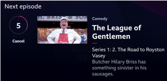
 Anything that provokes a sense of urgency or scarcity was a commonly cited source of anxiety. This includes the previously mentioned persuasive notifications and time-limited transactions as well as more benign features, such as the countdown to the next episode on media players like Netflix or BBC iPlayer.
Even security features that are designed to keep people safe and secure online can provoke feelings of anxiety. One respondent said, “I find 2FA [two-factor authentication] kind of stressful. ‘Enter this code!’ and watching the timeout tick down”. Another respondent lamented how “some sites intended to be inclusive and facilitate communication end up causing the opposite”. They described the often-frenetic nature of chat room platforms where “just logging on causes the user to be barraged by an attack of communication”, noting that this can be “very intense, hectic and panicky”.
Unpredictability
Whether it’s deciphering the doublespeak of opt-in or opt-out marketing checkboxes (“tick this checkbox if you DO NOT want to receive our newsletter”) or wondering whether you’ll have an opportunity to review your order before the confirmation page, the unpredictable nature of certain websites and apps was another commonly cited source of apprehension.
One respondent described their anxiety at having accidentally “liked” someone’s photo on Instagram by double-tapping it—something they had not expected to happen: “I didn’t mean to ‘like’ it, but will I look weird or like a stalker if I leave it? Or will I look rude if I remove it? … I find Instagram immensely stressful”.
Several described how read receipts—the system that shows whether a message has been delivered or read in apps such as WhatsApp and Facebook Messenger—can be a trigger for social anxiety. One respondent said: “You’re left wondering, have they read my message? Why aren’t they replying? Did I say something to upset them? Then you obsess over what you’ve written, trying to figure out if they could have misinterpreted it”.
Powerlessness
Going hand in hand with the unpredictability of websites and apps is the “overwhelming” sense of powerlessness they can provoke. Hiding key information, such as contact details or account-deactivation instructions, in difficult-to-reach corners of websites can result in users feeling helpless. One respondent described a recent experience with a pet-insurance provider: “Their website is set up to funnel you into a phone call with them, burying the online registration forms behind false walls, tricky wording and hidden links. I get anxiety talking on the phone, so it was a real challenge for me”.
Targeted advertising (where the browsing habits of consumers are tracked and then used to provide them with more specific adverts) was another commonly cited source of anxiety, with many respondents feeling powerless to stop the intrusion. One described how “a lot of my particular anxieties came into full swing when I learned more about how online advertising works. When I noticed Facebook ‘Like’ buttons on unrelated pages and when ads follow me around. The feeling that I had no privacy was claustrophobic and has led to so many anxiety attacks I have lost count”.
Sensationalism
 The final theme relates not to UI design but to content. We are living in an era of so-called fake news and media sensationalism, where information is deliberately distorted to push agendas and generate business. “Scaremongering and bias are sadly something our media are built on”, noted one respondent. “Bias and negative skewed thinking is already a problem with anxiety or depression, so to be led into panic through over the top and biased, often speculative garbage parading as news is a common problem”.
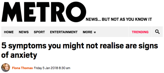
This is particularly the case for medical information, where irresponsible or careless reporting can have serious consequences for anyone with health anxiety. According to one respondent: “Right now, the flu is a big fear and it seems journalists are really milking that for all it’s worth. So many articles about this healthy person dying or the ‘top five symptoms that might indicate flu that you might not have heard of’ or whatever. Often the article isn’t scary … but after reading that headline it’s hard to get into a better headspace”.
My next post explores how we can avoid or reduce anxiety and panic triggers on the web and offers some practical guidance on how to improve accessibility for people with anxiety and panic disorders.
Comments
Interesting read – thanks, David.
This is a topic I’m passionate about on the web. Looking forward to Part-2 with practical guides! Not sure how to subscribe to it though..
Hard to say I “enjoyed” this read, but I do appreciate your research and sharing real examples of how standard web approaches fan anxiety. Looking forward to your follow up article.
Thanks for writing this, David. I don’t recall seeing this topic discussed before.
This behaviour is definitely the seedier side of marketing and copywriting, and I’ve been sucked into falling for it too. It may result in conversions, but at what cost? Increased stress and suspicion can’t be good in the long run.
The endless nagging and hundreds of popup messages with red text on Booking has driven us to try out other places to book hotels.