Warning: This post contains minor low-grade explicit language. Those easily offended may wish to turn away now. Although, that said, if the word ‘crap’ offends you more than the reason for its appearance here, you probably aren’t the target audience for this post.
Trust me when I say that I have uttered many stronger expletives—sometimes in my head, sometimes out loud—while auditing websites in recent years. All I can say is thank heavens for home working as I’m not sure I’d last long in an open-plan office these days. The reason for coming over all Sweary Mary these days can be explained by words and phrases like ‘React’, ‘Angular’ and ‘full-stack developer’. I’m referring to the often shocking state of markup that we see on the web these days. So what exactly is the problem? To explain that, I want to first take a few steps back. Cue wibbly-wobbly visual effect as we travel back in time to the mid-’90s.
Learning to build the web, ’90s style
Tickle-Me Elmo was all the rage, Tamagotchis were still a thing, dial-up connections and ISPs offering their wares via CD-ROMs were the norm. Some of you might be feeling very old at this point. I know I am. But 1997 was the year that I started to learn about the World Wide Web. At the time, I was working in a communications department, writing and editing for a monthly employee publication. After a couple of years of working on the same types of articles and wrestling with QuarkXPress, I was tempted by this whole Internet thing. I took it upon myself to learn how to create a web page, and I ended up creating an entirely digital version of the paper-based publication that I was working on at the time. I had the copy and pictures available and the desire to learn. But how did I learn? Well, two things:
- Right click > View Source
- The Yale Style Guide
The key thing was that I was able to look at a web page at the time and then pop the hood to see what was happening underneath. And because HTML (mostly) used tag names that made sense and often had equivalents to the sort of annotations that I would make when proofreading the printed publication I was working on, it was a fairly easy introduction. It just made sense.
Back to the future
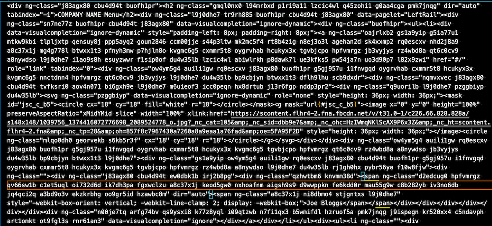
Now, let’s forget the previous gentle wibbly-wobbly visual transition as we come racing back to 2021. Instead, imagine some jarring cinematic jump cuts, loud screeching noises and overpowering music as the time traveller in this story is brought back to the present day, kicking and screaming, and is presented with this:

Whiskey. Tango. Foxtrot. (Technically, there is no swearing there, so we’re all good). Yes, that is real markup used on a site used by millions of people every day.
How does a beginner even start to make sense of this? Is it any wonder that accessibility professionals spend day after day lamenting the markup that they have to audit which shows no sign of any semantic meaning when they can’t do what younger me did and view the source and see some meaningful structure to the page content?
It’s likely that we’ll never return to those halcyon days where markup was simple to read and understand. The barrier to entry for those working on the web has been raised significantly, and the skills required to be a developer just keep on growing. The fundamentals of what makes a site accessible haven’t really changed, though. It’s still there—or rather, in some sites, it’s there. But those fundamentals can sometimes be lost among all the noise that gets added, often unnecessarily, by modern-day frameworks. It is very much a case that when trying to work out how a page is built, you cannot see the wood for the trees.
What we need is here is some kind of De-crapulator…
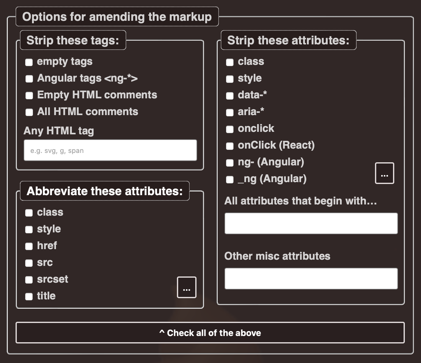
To try to make sense of what I was looking at every day, I created a tool to help remove some of this noise, to cut through the thickets and barbed weeds to see the underlying structure. I call it the HTML De-crapulator. (There’s your promised explicit language.)

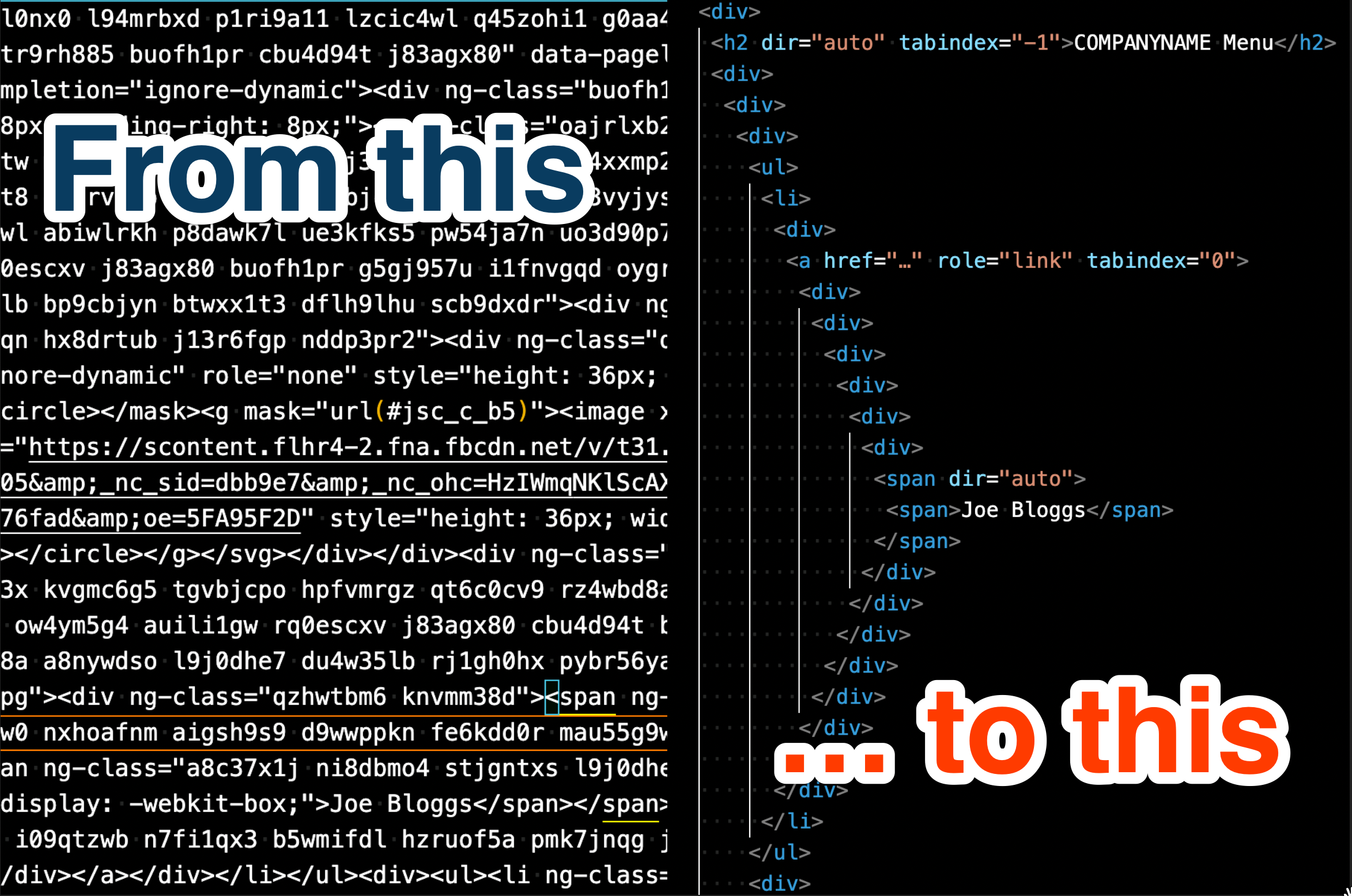
Its purpose is simple—to take the overblown attribute-laden markup that you see across the web and transform it into something simpler, cleaner and easier to comprehend.

While retaining the DOM structure, you can remove some predefined attributes, set your own attributes to remove, abbreviate some attributes and end up with something that you can copy and paste into whatever document or tool that you might be providing remediation advice in.
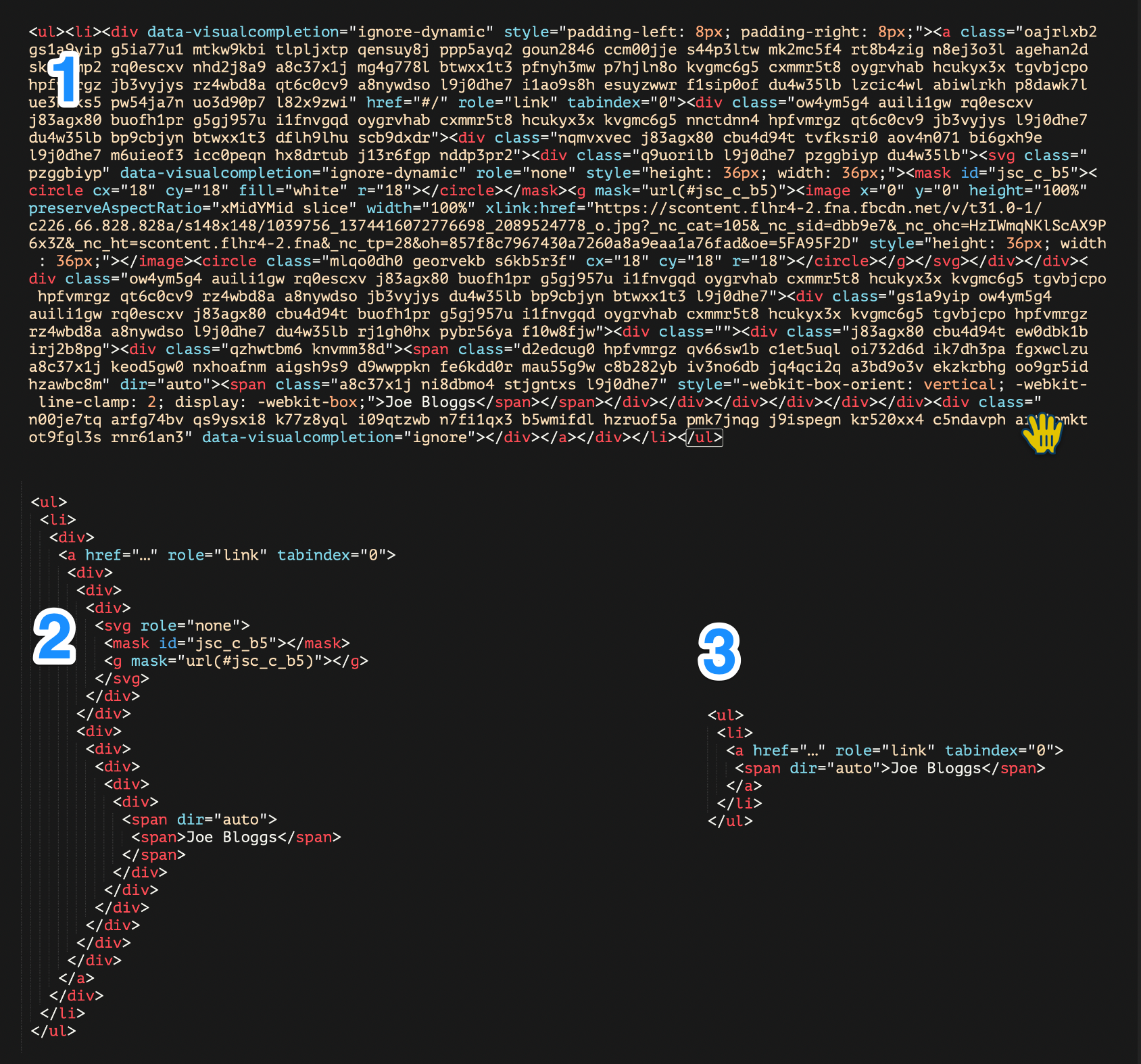
That wall of impenetrable markup further up? Here’s what it really looks like once you strip out all the nonsense:

Suddenly those once-invisible trees can be seen for what they are. But what’s that? An anchor with a role="link"? And a tabindex="0"? Even with the nonsense removed, you can see that there is still plenty to deal with. And just look at all those nested <div> elements.
Like I said, this won’t solve the problems of the state of frameworks or the poor quality of some learning materials we have available in 2021. We can’t have a web that is as pure and simple as it was in the mid-’90s. But if nothing else, for those of us trying to make sense of the mess that we find ourselves surrounded with now, there is at least a way to don our web X-ray specs and cut out the crap, before cracking our knuckles and drafting our remediation notes.

Comments
Well done, Ian! There was a time when I could easily decipher a web page. Not anymore! Your tool looks like an effective app.
Thanks, Mike. It is no exaggeration to say that I use this almost every day, sometimes many times a day when doing audits – and I guess that is not a surprise to you.
I fully endorse this little tool and I think it would be a great addition to any browser’s dev tools. I wish I could use it to decrapulate more things in my life than just code!
That’s a very nice gadget, which belongs as a bookmarklet, or better still, as a tab in the browser dev tools.