Internet Explorer and Edge have a vendor-prefixed -ms-high-contrast media feature which allows developers to detect if the user is currently in Windows High Contrast Mode, and to apply specific additional style rules in that situation.
The media feature supports three values that can be tested: active, black-on-white and white-on-black. While on the face this feature seems pretty useful, it arguably provides authors with very little actionable information.
Windows High Contrast Mode provides users with a selection of different ready-made high-contrast themes. For instance, in Windows 10 the user can choose between “High Contrast #1”, “High Contrast #2”, “High Contrast Black” and “High Contrast White”. In addition, users can redefine any of the colours used and save their own custom high contrast theme.
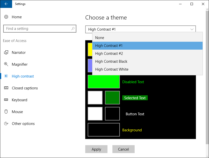
Regardless of which specific colour scheme a user has chosen, -ms-high-contrast:active will evaluate to true when any of these high contrast themes are enabled.
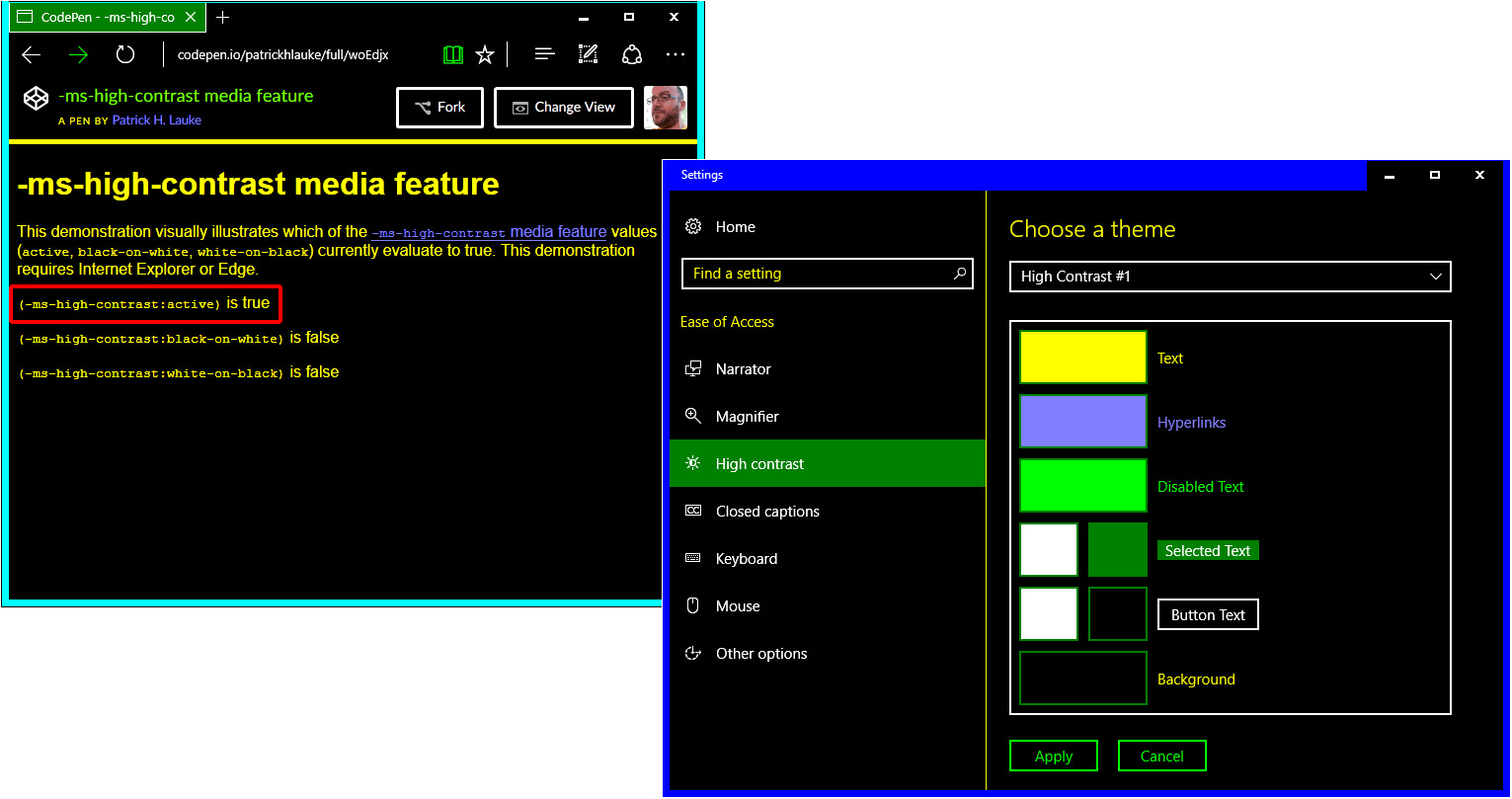
-ms-high-contrast media feature test, showing that -ms-high-contrast:active evaluates to true when the “High Contrast #1” theme is chosen.However, authors have no indication of what kind of colour scheme the user has actually enabled, so it’s not really appropriate for them to try and force a particular colour (possibly with the addition of -ms-high-contrast-adjust:none) or to load alternative resources such as images with “pre-baked” colors. Most notably, authors can’t really infer that -ms-high-contrast:active means the default “light colours on dark background” (and then perhaps try to force single-colour elements to use a white foreground colour), as the user may well have a colour scheme that favors “dark colours on light background” instead.
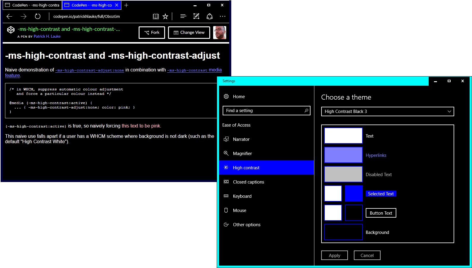
-ms-high-contrast-adjust:none to force a particular foreground colour when -ms-high-contrast:active is true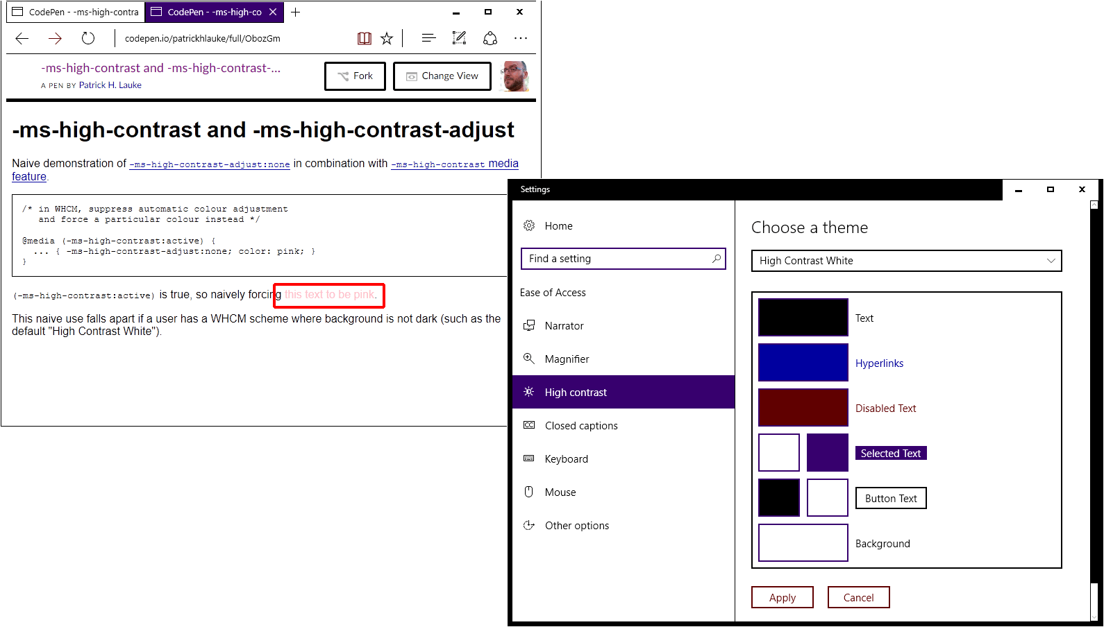
All authors can really do here is to ensure that their styles will “work well” in a high-contrast setting – and as so much of this will depend on all the (undocumented) changes that the operating system and the browser will make to the author’s CSS, there is really not a lot of mileage here beyond some of the more drastic changes such as avoiding the use of background images (which will not be rendered in high contrast modes in Internet Explorer) and instead making alternative visually hidden text for these images visible, if present.
The values of white-on-black and black-on-white initially appear to overcome the shortcoming of active: not only does the author know that Windows High Contrast Mode is enabled, but they can also at least get an indication of the type of high contrast colour theme the user has chosen. So if -ms-high-contrast:white-on-black is active, they could introduce additional style rules (and force particular colours using -ms-high-contrast-adjust:none) that work well on a black background.
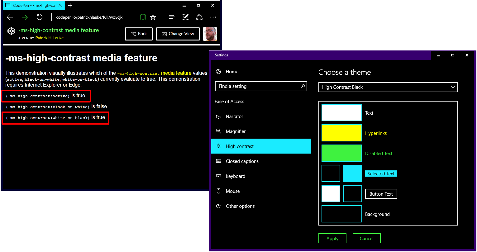
-ms-high-contrast media feature test, showing that -ms-high-contrast:white-on-black evaluates to true when a the default “High Contrast Black” theme is active.However, white-on-black and black-on-white are very specific values, and they depend entirely on whether or not the current high contrast theme uses pure white and pure black for the respective foreground/background colours. This is of course the case for the default “High Contrast Black” and “High Contrast White” themes. As users can customise the specific colours used by Windows High Contrast Mode themes, every time even a custom theme uses pure white for text and pure black for background, the related -ms-high-contrast:white-on-black will evaluate to true (and vice-versa for black-on-white). But as soon as a user/theme strays slightly from these very specific combinations, the queries return false. For instance, using pure white foreground text on a dark blue, rather than black, background results in -ms-high-contrast:white-on-black quite logically evaluating to false. As such, these two values are of limited use, and will only evaluate to true in very specific conditions.
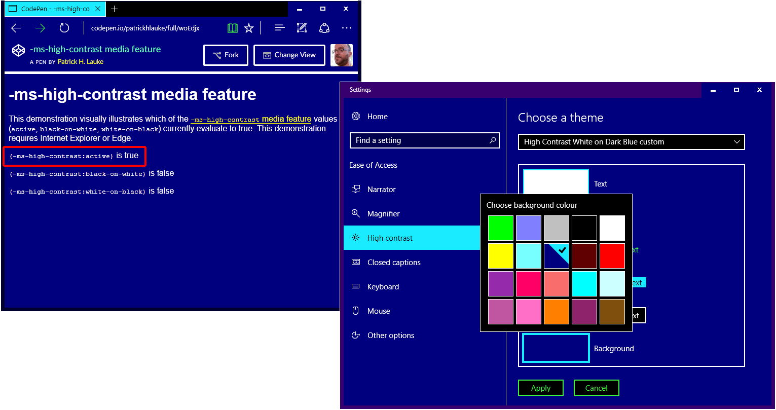
-ms-high-contrast media feature test, showing that -ms-high-contrast:white-on-black does not evaluate to true if the high contrast theme has white foreground text on a custom dark blue background.In summary, while on the face the -ms-high-contrast media feature may look useful for authors, in practice the information that an author can get from querying this feature is limited (in the case of -ms-high-contrast:active) and only applicable in some very specific situations (for -ms-high-contrast:white-on-black and -ms-high-contrast:black-on-white).
Comments
The more I’ve played around with high contrast, the more I am convinced that the best way to think of it is as a “custom colors” media query or “accessible colors” media query. Basically, a warning that the user is over-riding your color scheme. It could be used to turn off custom colors or graphical effects, but should not lead to any assumptions about what color scheme is preferred. If you’re going to use it to set colors, such as in an SVG or canvas graphic, I think the best approach is to use the CSS System Colors keywords (https://www.w3.org/TR/css3-color/#css-system) to match the colors that the browser will automatically apply to the rest of your page. The following CSS system colors are updated in MS Edge & Firefox to match the corresponding colors in the Windows High Contrast Mode (WHCM) dialog:
There is no CSS named color that corresponds to the Hyperlinks text color in WHCM. MS Edge applies the WHCM to hyperlinks regardless, but Firefox uses the default blue color. CSS System Colors test case with SVG color swatches for each color: https://codepen.io/AmeliaBR/full/JbaZLX/
Unfortunately, Firefox does not respond to the (-ms-high-contrast) media query, and does not have their own -moz- media query for custom color modes. If you’re using the media query to fix color schemes or images, they won’t see any of your adjustments.
“It could be used to turn off custom colors or graphical effects” however – if we’re talking about the HTML/CSS side here – these are already turned off /overridden by virtue of the high contrast mode itself being active.
CSS system colours were brought up in discussions leading up to this blog post. Though officially deprecated in CSS 3 (something which I incidentally questioned all the way back in 2005 https://lists.w3.org/Archives/Public/www-style/2005Sep/0010.html), these do indeed still work in IE and Edge.
Greg Whitworth has written up a response to this blog post: How to use -ms-high-contrast Some excellent information about
-ms-high-contrast:activeand the use of the (deprecated, though still working) CSS system color identifiers. And the main take-away for me is: use the-ms-high-contrastmedia query as a high-level indication that the user is indeed in high contrast mode, and if needed use CSS system colors to ensure certain colors are applied.But I still stand by the fact that
-ms-high-contrast:white-on-black/-ms-high-contrast:black-on-whiteare mostly pointless since they only apply to two very specific scenarios.For
-ms-high-contrast: black-on-white | white-on-black, I guess the reason for them is that these are the two most popular schemes among the users of High Contrast theme. You can provide optimised image resources for these users. My personal blog uses them extensively. For most screenshots exhibited in my entries, I provide four versions — non HC, BoW, WoB, and a fall back version. Usually the fall back version is generated by taking the screen shot of HC#1. But recently I have been using my own scheme.Having
-ms-high-contrastavailable implies you are using a browser that should provide the colours to you, therefore it is safe to use CSS system colours.The same logic applies to Windows app development — the XAML framework supports themed dictionaries, which includes 6 themes – light, dark, BoWHC, WoBHC, CustomHC and AnyHC. Most of the time one only has to use light / dark + AnyHC.