This article is one in a series of articles on TPGi blog aimed at unpacking each of the Inclusive Design Principles. This time the principle is Be Consistent. Look out for the others.
Such is the power of consistency in design that I’ve taken to saying, “I don’t mind if it’s bad, so long as it’s consistently bad.” And I’m only half joking. An interface that’s a grab-bag of ideas, some good and some bad, may show signs of potential but its very inconsistency is its ultimate failure. Whereas, at least a persistently poor interface is somewhat predictable.
Sometimes users get accustomed to your poor implementations, so much so that it causes confusion when they’re replaced. It doesn’t matter if the new solution is easier to use; it’s something different that has to be learned, and that’s painful.
There are two dimensions to consistency that need considering when building an interface. Let’s deal with these in turn.
- Internal consistency
- External consistency
Internal consistency
Internal consistency is all about an interface’s success at being consistent with itself. An exercise some organizations interested in building a pattern library undertake is to first create an inventory of existing patterns. Invariably, there turns out to be more patterns (solutions) than problems.
“Why have we got seventeen different button styles?”
If things look (or sound, or feel) different to one another, users expect them to be different — to behave differently, belong to different mechanisms, and to achieve different ends. That is, inconsistent design makes interfaces seem more complex than they are. To a user, “seems complex” and “is complex” are indistinguishable.
The problem of inconsistency affects all types of users, but can be experienced differently. A sighted user may have trouble unpicking the visual complexity of an interface, while a blind user may find that complexity echoed in the poor underlying structure their assistive technology software has to navigate.
Consistency shouldn’t just be between discrete elements, but the larger mechanisms employed for users to achieve tasks. Two different parts of a website may offer the opportunity to search two different catalogues of content. But the search mechanism itself needn’t come in two distinct designs. Whether you’re searching books or audio books, search is still search.
Often, large organizations divide themselves into separate development teams. This could lead, for example, to the books and audio books departments designing their own search interfaces. Not only does this mean more code being written and maintained but you’re asking users to learn two interfaces rather than just one, for no good reason.
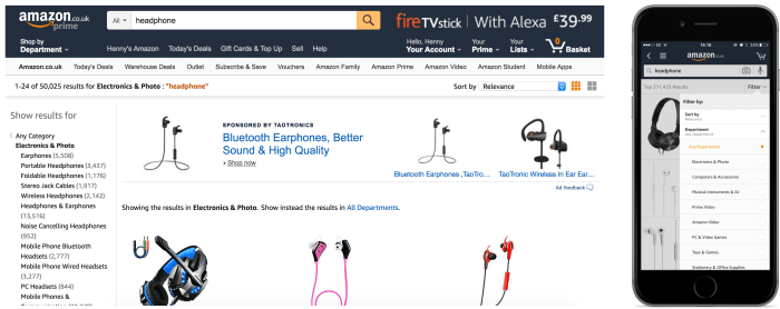
Of course, the principle should apply not just between different sections of the same interface, but between whole platform-specific versions of that interface. Amazon should be commended for the consistency of their search between desktop and iOS: if you enter a search term on desktop you get exactly the same categories of search suggestions there as on iOS.
The desktop version of the application may be used in the office, while the iOS version may be used at home. These changes in situation shouldn’t mean arbitrarily needing to adjust to different experiences. (This speaks to the complementary Consider situation principle.)
It’s important organizations have style guides and pattern libraries that are shared between departments. Each pattern in the pattern library should be the singular solution to a particular, organization-wide problem. The main purpose of a pattern library is to uphold consistency.
External consistency
No interface exists in a vacuum. It’s informed by the culture of interface design to which it belongs. External consistency means consistency with patterns external to your own work, belonging to the wider discipline of interface design. Solutions become conventions and later traditions that form part of our shared language of digital communication and interaction. We all drink from that well.
Just as in natural language, the language of interaction evolves over time as new “words” (patterns) are coined and old ones fall out of favor. Say what you like about the “hamburger menu” but it didn’t come out of nowhere. As a designer, you may even innovate something new from time to time that takes off. But it’s important we speak the same language, and that we heed consensus when it comes to the formulation of conventional interface elements.
A big part of this is ensuring that what appears familiar behaves as expected. For example, what appears to be a conventional tab interface should adopt the keyboard behaviors that have come to the web platform from desktop. If you are not sure what these behaviors are, you can often consult the WAI-ARIA Authoring Practices site.
Interfaces that break too many rules may win design awards, but they’ll also alienate users. As a rule of thumb, users should be able to look at any part of your interface and think, “I’ve seen something like this before”. Not exactly like it, but like it. Navigation should look like your navigation, but not be mistaken for anything other than navigation. Forms should look like your forms, but they should have everything one would expect forms to have. Your footer should contain your contact details and, consistent with other people’s footers, should be found where footers go: at the foot.
We can’t help that users bring preconceptions to interfaces. You need to find out what those preconceptions are, and when to accommodate or challenge them. Most of the time users aren’t looking for a fresh and challenging interface, but fresh and challenging content delivered in an expected and consistent way.
A full explanation of each principle can be found on the Inclusive Design Principles site or in the related blog posts below:
- Provide a comparable experience
- Consider situation
- Be consistent
- Give control
- Offer choice
- Prioritise content
- Add value
