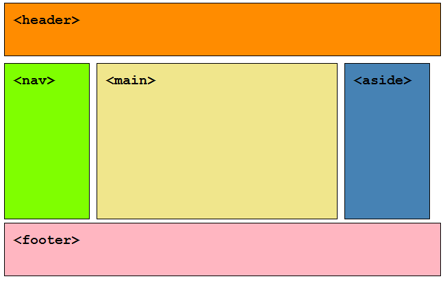
Typically designers and web developers divide web pages into macro content areas (let’s call them regions). Doing an image search for typical web page returns lots of examples of diagrammatic representations of web pages with similar regions delineated:
- header
- navigation
- main content
- sidebar
- footer
All of the page content is organised into a small number of regions which are parents of the rest of the page content. Usually these regions are identifiable visually by design and the type of content they contain, a user can scan the page and quickly get a feel for the page content and find what they are looking for. With HTML5 you can express this visual organisation semantically in your code. By using just 5 elements (aside, footer, header, main and nav) available in HTML5 you can provide the understanding and navigation benefits of content organisation to users who would otherwise not be able to perceive it from the visual cues alone:

Code example
<header></header>
<nav></nav>
<main><main>
<aside></aside>
<footer></footer>
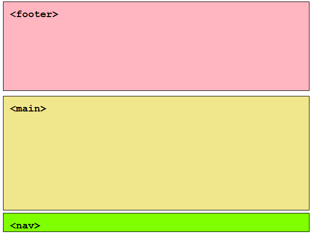
Region order
The order in which the elements are organised and the region types used is based on your content organisation. Hell, if your content is organised such that you have a fat footer at the top of the page and navigation at the bottom, then so be it.

Code example
<footer></footer>
<main><main>
<nav></nav>
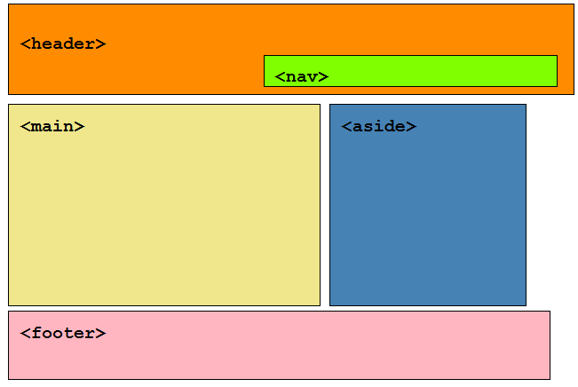
Regions within Regions
If you content organisation is such that a region is nested within another region, go for it.

Code example
<header>
<nav></nav>
</header>
<main><main>
<aside></aside>
<footer></footer>
That’s it!
When it comes to using HTML5 structural elements to define page regions the semantic magic is done by the browser (mapping the elements to ARIA landmark roles). There are a few general rules that will help users get the most out of your semantic markup:
- Ensure all page content is within a region.
- Less is more, regions are macro structures, so use them parsimoniously. As their number increases their utility to users decreases.
- To mark up more granular content, within regions, use article/section/headings/paragraphs/lists etc.
Comments
Hi Steve!
Do you know who is responsible of creating html5 structures and his/their principles to create (design) its set?
IMHO they should follow the MECE principle and generic schema concepts, but it does not seem to be the case.
CSS3 do not seem to follow either this principle. With its new specification drafts they propose bizarre things like more than 10 float values. An object oriented approach would be more intelligent.
I would appreciate to read your thoughts about it.
Hi ant, the HTML design principles document may be helpful. As for CSS that is develped by a mostly different set of people (to HTML). You will need to ask the CSS Working Group.
Thank you, Steve!! 🙂
Thanks for the simple, succinct post. I *so* want to structure my markup to a generally-agreed-upon standard, but there doesn’t appear to be any. For a while I was chugging along with the “document outline” concept, but it is terribly confusing and not even used for any purpose by browsers or screen readers.
So I’m totally on board with your suggestion here to just use header/nav/main/aside/footer for the top-level page structure. But a few questions:
1) In your opinion, should I *only* use those elements at the “top level” of the hierarchy? Or is it okay to next them (like the “document outline” definition of header/footer, which can be nested inside sectioning elements)? By “should” I mean “does this help real-world accessibility”, not “according to some spec nobody understands” 🙂
2) Can you share your opinion on the difference between “article” and “section” in terms of real-world usage and being helpful (or not) to screen readers? I gave up on using “article” because the very definition of it in the HTML5 spec says “for content that could be understood outside the context of the page … for example a comment on a blog” — which is TOTALLY contradictory to me (how the heck does 1 comment on a blog make any sense outside the context of the other comments or the original blog post it is referring to?).
So do you think it’s safe to just ignore “article” and only use “section”?
Us web developers who *want* to do the right thing by accessibility but don’t know how could really use some help! Thank you.
This ideal HTML organization matches perfectly with the form of the “classless” https://websitesfortrello.github.io/classless standard for CMS themes (see https://workflowy.com/s/Q79FgxLKUT).
In many websites the “main” markup is missing – is there a particular reason for that?
Do you mean use of the
element? if so, suggest its due to the element only being around for a short period of time compared to the other structural elements.Hi Jordan, as I mentioned on A11ySlackers:
headeris mapped to abannerlandmark role andfooteris mapped to acontentinfolandmark role, when not a child ofarticleorsection.For example:
Neither
headerorfootersemantics equate to landmarks.As for
articleandsectionuse, I came upon this article which may be hepful: Sectioning Content in HTML5 – div or section or article?.Hi Steven,
Thanks for the response. About the article-vs-section issue: the thing that still baffles me is figuring out what the definition of “self-contained” content is. Super obvious if we’re talking about a newspaper article or an individual blog post. But the HTML5 spec ( https://www.w3.org/TR/html5/sections.html#the-article-element ) lists “user-submitted comment” as an example of self-contained content — and this just baffles me completely because I don’t understand how a blog comment could ever be considered self-contained (since it exists in the context of the blog post it’s responding to, as well as the “conversation” created by all the other comments for that post).
Perhaps this is just 1 bad example, but if I take it at face value then it makes me think “hmm… well maybe an article is really just any string of sentences that makes a coherent whole”, in which case, why isn’t every individual paragraph an “article”?
On the flip side, thinking about what a “section” is, the spec says this:
“Examples of sections would be chapters, the various tabbed pages in a tabbed dialog box, or the numbered sections of a thesis. A Web site’s home page could be split into sections for an introduction, news items, and contact information.”
Now I’m really confused, because how are those things not considered “self-contained content”? A chapter in a book? Totally “syndicatable” (I see it all the time in magazines, where they excerpt a chapter from an author’s upcoming book). What about the portions of a home page… why would the contact information (for example) not be considered “self-contained” content? I could very easily see that block of info being “syndicated” in some other context and it making complete sense. In fact, that’s the very definition of “self-contained content” to me (it’s a bunch of information all relating to the company or organization).
As with all the confusing aspects of HTML5, I’m left with a desire to not worry about the theory and instead do what’s helpful to people using assistive technology. And based on other things I’ve seen, screen readers currently don’t treat “section” or “article” tags as having any semantic value because they have been so over-used by authors (like, people just replaced all the divs in their markup with articles and sections, even if it didn’t make semantic sense to do so). But perhaps I’m wrong about this — I’d love to know what I can do with my markup to make it the most usable for all my visitors.
Sorry for the ramble, and thanks for all the great information you provide!
-Jordan
Hm, I suppose some comments often get linked as standalone content, not that the site author would know this beforehand. Example:
https://stackoverflow.com/questions/1732348/regex-match-open-tags-except-xhtml-self-contained-tags/1732454#1732454
I like to add that in practice for styling purposes the horizontally stacked regions should be wrapped in a div.
For much used patterns like `holy grail` of `sticky footer`, a wrapping div is needed in responsive sites.
Example: https://philipwalton.github.io/solved-by-flexbox/demos/holy-grail/
To speak in tradition, may I introduce another `Rule of 5`: a modern responsive HTML family should consist of 5 members. A head, a body, and three children in the body.
Easy to remember and allows for most design patterns
You can add
divelements wherever and whenever you like based upon your design needs.divelements are semantically neutral and as a general rule are not exposed in the browser accessibility tree, or exposed in a way that does not have an effect on the aural UI of HTML.Cases of
divuse to watch out for:Hi Steve, thank you for your post, I do have a question regarding the
tag. It sort of looks like you wrap everything in this tag (say 5 different ‘widgets’ or ‘blocks’, while it’s not true, as far as I understand.
Hi Alex, there is nothing in the HTML spec that precludes the use of the
asideelement as a macro content container and given its mapping to thecomplementaryrole in Accessibility APIs and consequent expression in the aural UI of HTML it makes sense to use it for this purpose.Hi Steve. Thank you for your answer, I find it both informative and to some extent a bit surprising.
If you could possibly look through the following bits of code and say whether they all are perfectly valid and interchangeable, what-you-like-best ways of marking up sidebars, it would be super great. Sorry they are a bit long, but it’s better like this than my poor explanation of what I mean 🙂
I have recently participated in another discussion on one of the Russian blogs that deal with just the same thing, I’m afraid I may have transeferred wrong understanding of the spec. I will deliver your answer to the Russian community as well.
The example HTML bits are taken from the spec, but they were changed so that we could see several combinations.
asidewith sectionsIt mainly represents your previous comment that an
asideelement can be used as a macro content container and have several ‘blocks’ in it:a block with
asidesThis is directly from the spec, but wrapped in a
divfor styling purposes:Nested
asidesThere’s nothing in the spec that prevents nesting
asides. What’s your opinion on this variant?If they are equally good and can be used interchangeably, it will definitely throw much light on the usage of this tag. Thanks.
Sorry for the bad formatting of the previous, looks like the
pretag is banned, please feel free to edit my samples so that they looked better 🙂