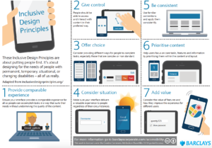
Our friends at Barclays have designed some beautiful posters of the Inclusive Design Principles shared under Creative Commons. We thought we’d ask David Caldwell, Digital Accessibility Manager at Barclays, to share with us how they are using the principles in-house. Before I hand over to David I’d like to say a huge thank you to you and your team for the posters and your insights.
I’m really pleased to have been asked to write a guest blog for the Paciello Group and even more pleased that it’s on the topic of the Inclusive Design Principles.

Before I launch into telling you about how we’re using the Inclusive Design Principles, I should probably let you know who I am. I’m David Caldwell, I’m a Digital Accessibility Manager at Barclays where I work across a wide range of different pieces of work the biggest of which is currently our training and development programme for accessibility called The Accessibility Academy.
For those of you who don’t know who Barclays are we’re a transatlantic consumer, corporate and investment bank with a strong presence in our two home markets of the UK and the US. Our global purpose is to help people achieve their ambitions which is particularly pertinent for our work in the accessibility agenda. For the agenda we also have an ambition to become the most accessible and inclusive company in the FTSE 100- an ambition that’s grown over time and which we use as a call to arms for our colleagues, suppliers and partners.
One of the biggest challenges we face as a global organisation is delivering a consistently accessible and inclusive experience to all of our customers and clients regardless of whether they’re opening their first bank account, looking to buy their first homes, a sports fan wanting to get cashback on their ticket purchases or a multi-national looking for a cash management platform. With over 60 million customers we’re always going to have a need for accessible and inclusively designed digital solutions but with globally and organisationally dispersed teams it’s always going to be tough to make sure we give everyone the best experience.
Over the years we’ve tried lots of different approaches to help build knowledge and understanding with varying degrees of success. Last year we created a simple to use infographic highlighting the POUR principles of accessibility and we’ve been leveraging ideas and concepts from the likes of IBM and Microsoft on broadening the scope of accessibility to be more about inclusive design.
That’s why when we saw that TPGi had created a new set of Inclusive Design Principles we jumped at the chance to take the amazing content they’d created and add our own Barclays twist. Working with our Designers we’ve created two sets of posters:
- An A3 poster with a summary of the 7 principles
- A set of A4 posters which provide a more detailed view of each of the principles.
The hope is that we’ll start to encourage designers and developers to think more inclusively when they create new products and services.
We’re now exploring new ways of sharing the posters with our teams here at Barclays including hosting a webinar with Henny on the topic of Inclusive Design, using the posters as part of the Accessibility Academy and signposting them through newsletters, intranet articles and blogs.
We’re also really keen to get them out into the hands of as many people outside of Barclays too. One of the core principles our Digital Accessibility Team work to is open sourcing and sharing as much as we can and that’s why I’m proud that we’ve released the posters to the world with a Creative Commons licence. This means that anyone can not only use the posters but can take what we’ve done and build on it. We’re really pleased with the response we’ve seen so far through our initial launch with TPGi and we’re currently working with other partners such as The Business Disability Forum to launch them more widely.
Last year, as part of our open sourcing and sharing approach, we launched the Barclays Corporate Accessibility Portal. Created by our colleagues in our Corporate Bank and in partnership with some of our Corporate customers, the portal brings together best practice resources- some which we’ve created and some which we just love. The principles are available on the site along with other resources we’ve created including the POUR infographic (PDF), our diverse personas (PDF) and our Let’s Talk Accessibility and Accessibility Myths animations.
We’d love to hear your feedback on what you think about the designs as well as how you’re using them. Get in touch via @BarclaysAccess and look out for more resources coming later this year!
A full explanation of each principle can be found on the Inclusive Design Principles site or in the related blog posts below:
- Provide a comparable experience
- Consider situation
- Be consistent
- Give control
- Offer choice
- Prioritise content
- Add value